Explore Rhode Island
Redesigning public park information with responsiveness in mind
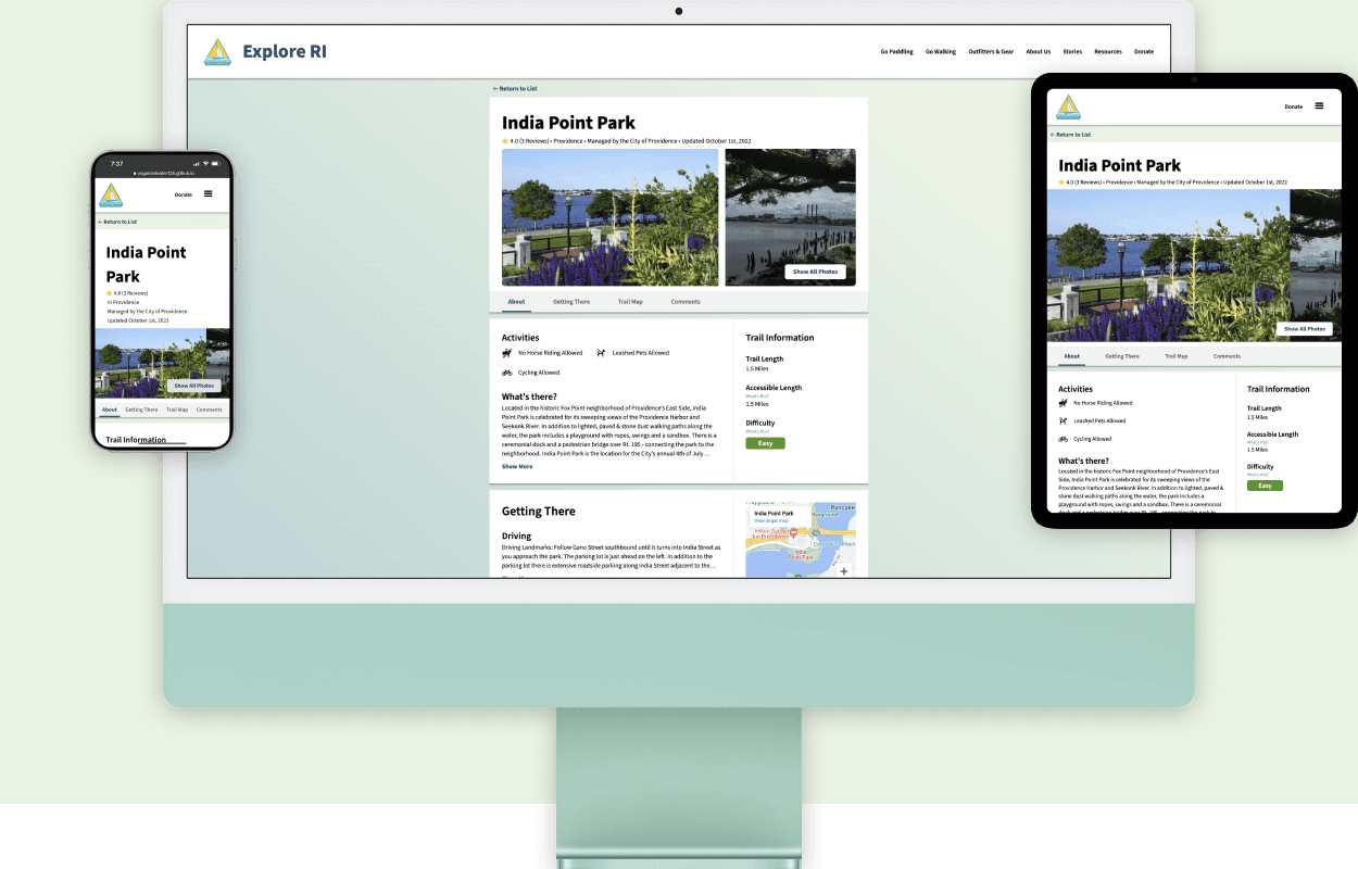
Made frequently used public park website responsive and intuitive so that more users can access key information (such as ADA accessibility) on the go.
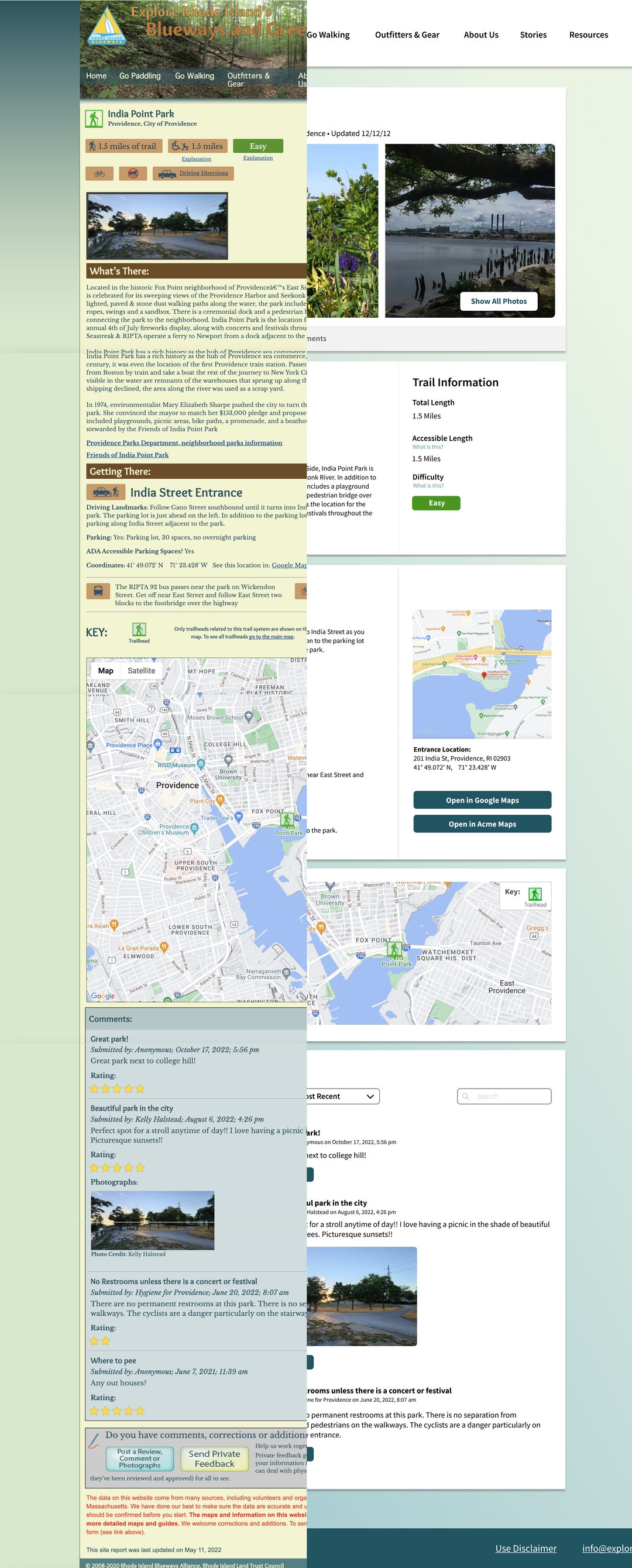
Redesign and development of the Explore Rhode Island park page, often the first result when searching for information on local parks and trails. Site contained information such as ADA accessibility information hard to find elsewhere - a significant motivation to my redesign.
My redesigned, responsive website better met the needs of users visiting across platforms.
UI/UX Designer
User Researcher
Frontend Developer
Oct 4, 2022 - Oct 18, 2022 (Two weeks)
Figma, Balsamiq Wireframes, HTML,
and CSS
Mobile
Tablet
Desktop
This project challenged me as my first redesign.
Before this, I had mostly used Figma for working on isolated projects or tutorials. This redesign let me better master Figma and fully follow through research, prototyping, and development.
To start, I put myself in the shoes of the the user.
Due to the limited time frame of two weeks, and the nature of the class assignment, I decided to start my research process by conducting a series of cognitive walkthroughs.
I came up with a list of 13 broad scenarios containing a series of tasks that a user might expect to complete. These included the following scenarios.
Checking if the park has wheelchair-friendly trails and ADA accessible parking
Examining the distance and difficulty of the park’s trail
Learning how to access the park across several modes of transport
Reading and responding to submissions and questions from other users
Planning trail routes for trips ahead of time
I then ran through each scenario while asking myself the following questions:
Will the correct action be sufficiently evident to the user?
Will the user notice that the correct action is available?
Will the user associate and interpret the response from the action correctly?
While walking through, I also refrenced Jakob Nielsen's 10 Heuristic Principles to fuel my insights. Each task was repeated thrice across mobile, tablet, and desktop devices. As a result, these walkthroughs provided me insight into what issues were likely hindering the experience of the website's users.
I also used WebAIM's WAVE tool to assess site accessibility.
I chose to use this to assess the site for use with screen readers, keyboard navigation, and regarding contrast levels. This tool proved invaluable in helping me to understand how users with impairments might experience the site.
With these insights, I explored the key problems I would focus on.
On a broader scale, the website had significant issues surrounding
organization, platform responsiveness, and accessibility.
My walkthroughs led me to 5 main pain points in the original design:
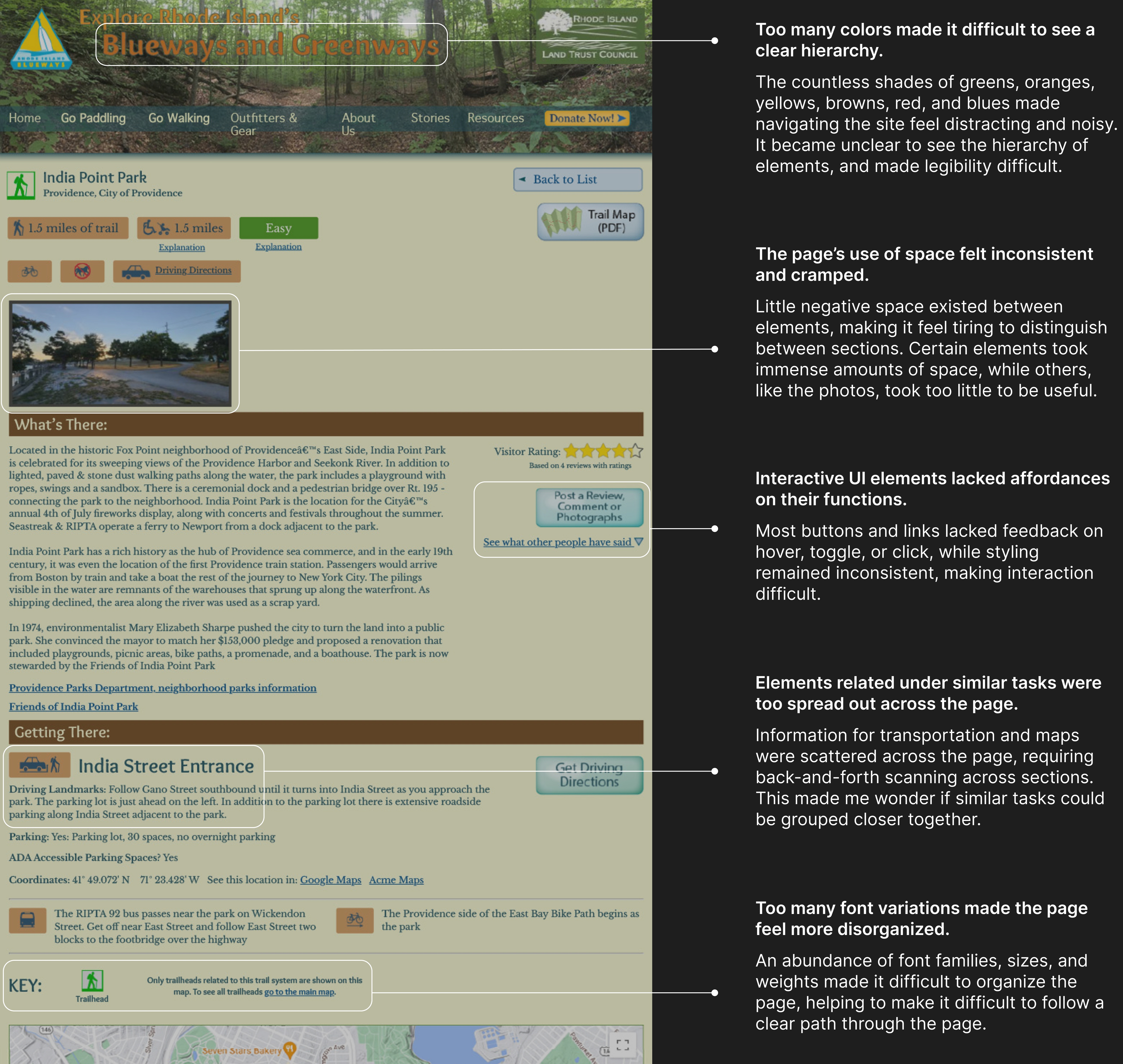
The WAVE tool highlighted other possible issues to my attention, including:
Skipped heading levels and smaller p tags styled to match larger headings.
No page regions and no use of ARIA outside of linked Google maps widget.
Low contrast and size warnings on a significant amount of text on buttons and paragraphs.
A complete list of my findings from my research process can be viewed here.
Competitor Analysis
I viewed at a variety of platforms online that sought to accomplish similar functions as Explore RI.
I wanted to see what design patterns I could apply to my redesign.
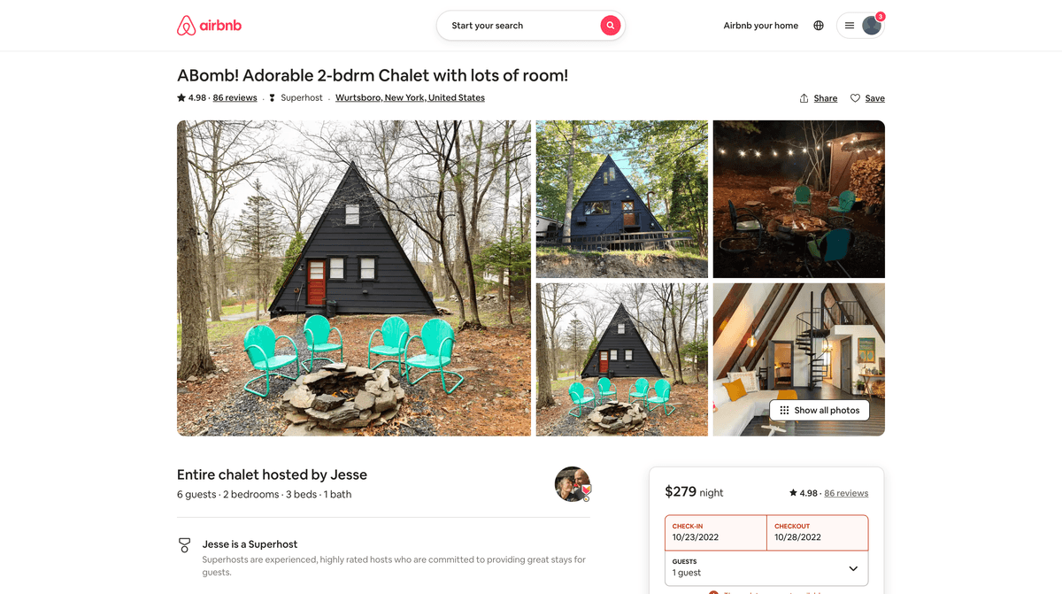
AirBnB's experience is a lot less cluttered while still sharing a significant amount of information about a location, with a sparingly-used accent color and considerable white space.
Photos take considerable space in the center, allowing the user to immediately see what a location looks like.
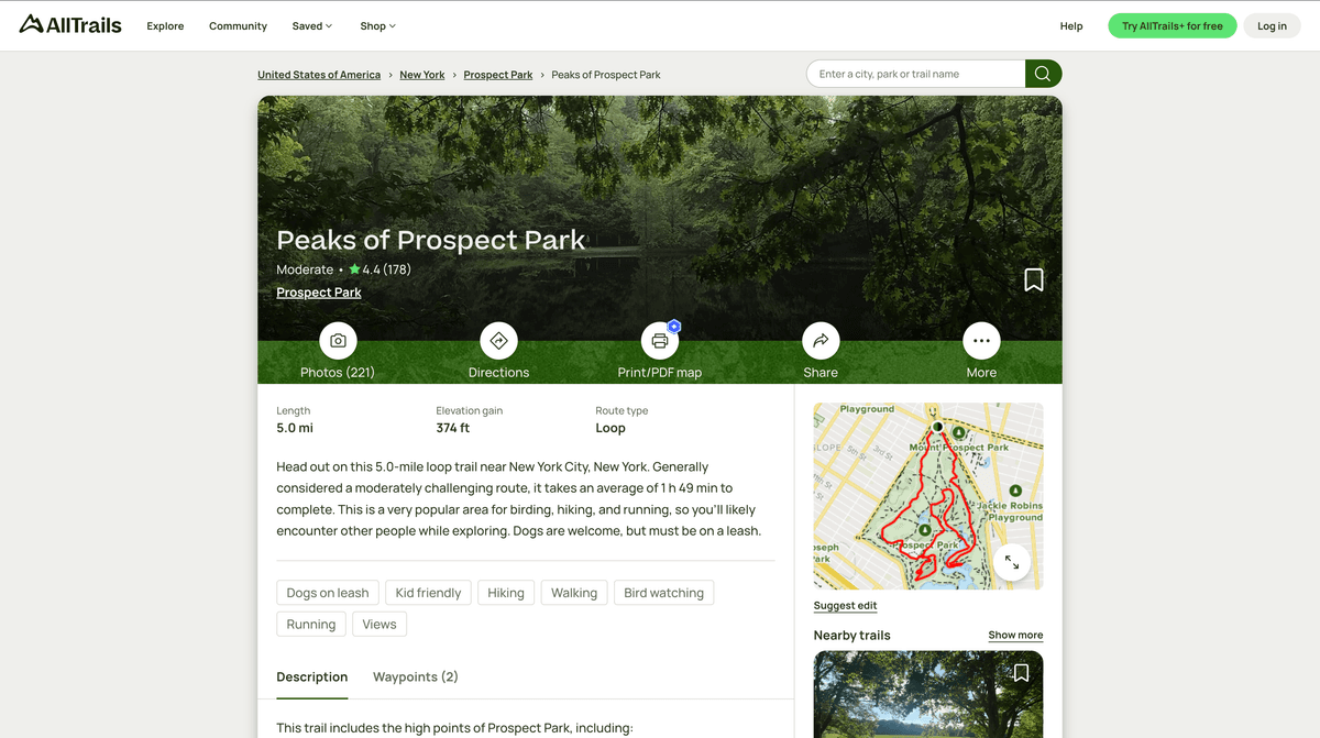
AllTrails features photos and trail at the start of the page, while a trail map is similarly included at a much smaller, preview size.
Content is split in a 2:1 column ratio with text-heavy sections on the left, making more efficient use of horizontal space and aiding the page's sense of order through alignment.
I then created three wireframes, with one for each platform.
I focused on mapping out the layout of how the website would be structured using Balsamiq Wireframes. I prioritized making an overall structure that would translate easily across desktop, tablet, and mobile, with a strong sense of organization and hierarchy.
Each wireframe is annotated to show why a particular design decision was made.
I then developed three high-fidelity prototypes in Figma, with one for each platform.
My design choices can be broken into the three changes of
visual design, structure, and consistent language.
Visual Design
Visually, the original website often felt extremely crowded and noisy while in use, lending the website to feel uninviting for users.
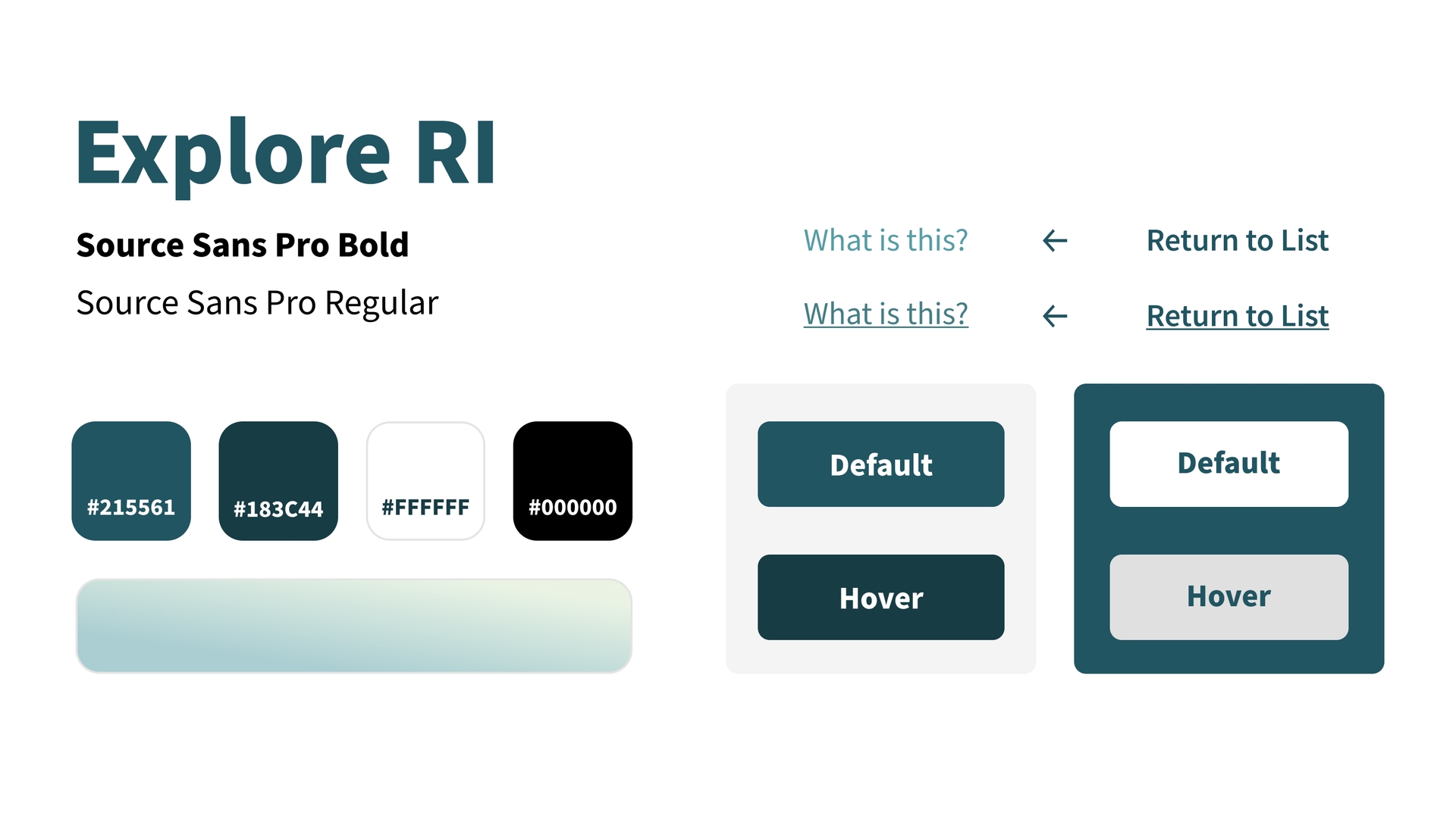
I reworked the website's visual design system to help make the feel of the website more inviting and clean for users. Working off of the original blue and green color palette, I made changes to improve usability while maintaining certain elements from the previous visual design theme.
This new design style was developed with the following goals in mind:
Creating a lighter mood
The original was filled with an excess of visually dense colors, with dark browns, blues, and deep greens populating the space.
I used a lighter color palette, with a much lighter blue-green gradient background, and backgrounds of mostly white. I also flipped the gradient direction to move from light to dark to draw the user's gaze to scroll down the page.
Lastly,drop shadow effects were also added to distinguish elements rather than borders and drastic color changes. I also strayed from the original's use of boxier elements to using more border radius and rounded shapes to aid this new theme.
Improving contrast and legibility
Throughout the page, I made an effort to use as much blacks and whites as possible to emphasize contrast.
Furthermore, I chose a new, darker sole accent color of #215561 to maintain good contrast ratios against the lighter background when highlighting specific elements.
Emphasizing interaction
With a more streamlined use of color throughout the page, I used contrasting colors to visually emphasize interactable elements to distinguish them from regular content.
The original website's button styling, with thick, dark borders, did not match the lighter feel of the website I wanted to create. In response, I avoided the use of borders in buttons in my redesign, using instead more rounded corners and colors to emphasize them better.
Restructuring
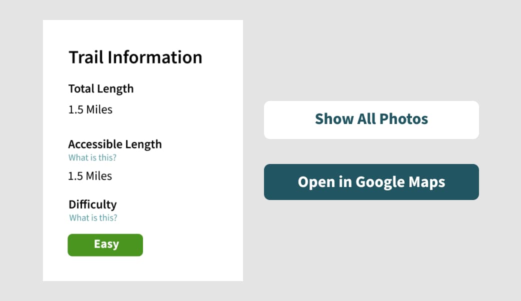
My research showed me that the original website contained a lot of useful information for many different tasks, from driving directions, trail maps, and community-submitted content.
However, it became clear that this information was largely inacessible due to subpar organization and a confusing structure that made navigating the website and scanning quite frustrating.
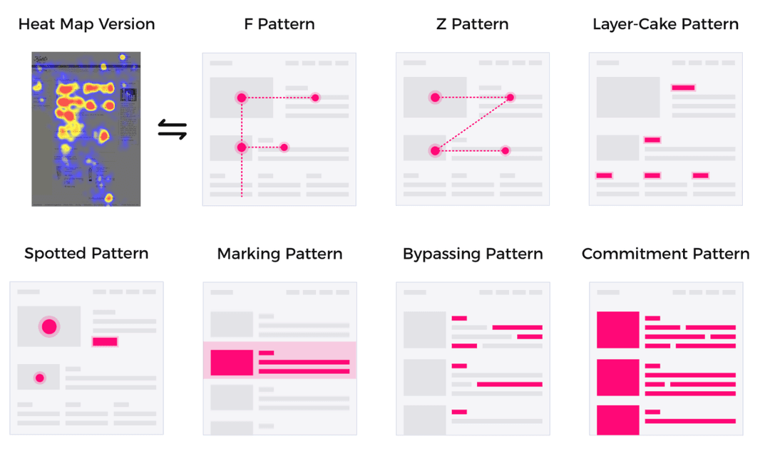
To solve this, I restructured the site to encourage the layer-cake scanning pattern, as it best allows users to efficiently and quickly find information that they need.
When users, while scanning through a page, fixate mostly on the page’s headings and subheadings, with deliberate occasional fixations on the (body) text in between.
The overall structure of my redesigned website focused on the two ideas:
Clearly distributing sections
Content is distributed into groups that are, for the most part, completely distinct with no overlap between groups, removing confusion on where information is located in the page.
Following a grid structure
The page structure follows a consistent grid that divides each section into thirds. With this grid, users will be able to easily scan vertically across sections by following the implied lines of the grid. Certain sections are then split in two columns with a 2:1 width ratio. This allows users to view related content by predictably scanning horizontally.
Initially, I tried fitting each section with just one column. However, this made paragraphs difficult to read, and also made the sizing of certain elements such as maps fit awkwardly.
I also experimented with splitting sections into equal columns of two. Although this was better than one, after further experimentation I found that having a 2:1 ratio allowed more efficient use of space. I also found that the asymmetry with the 2:1 ratio helped to further delineate a clearer hierarchy through size.
This restructure was aided by the inclusion of two types of page elements:
Navigation bar
A navigation bar is included near the start of the page that acts as a table of contents, and provides an overview on the sections further down the page. On click, these links allow users to quickly navigate to a specific section.
Marking content with headings
To help the user to scan, headings and subheadings are included throughout the page in a consistent, predictable manner.
Font weights and sizes let these headings visually stand out to help users latch on to them. These also help screen readers to more easily navigate the page.
Consistent Language
Another frequent issue I discovered through my cognitive walkthroughts was the lack of consistent language used across the original website.
These inconsistencies made it difficult to understand what information was supposed to be communicated, and created frustration during my cognitive walkthroughs.
More verbs, less nouns
Instead of mixing unaccompanied nouns and verbs, text accompanying interactive elements always address the user and start with an action verb. This helps to make it clearer to users what different elements do.
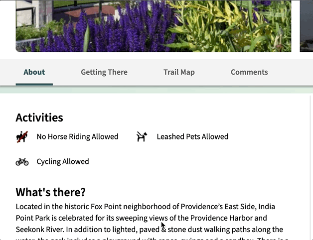
Labeling icons
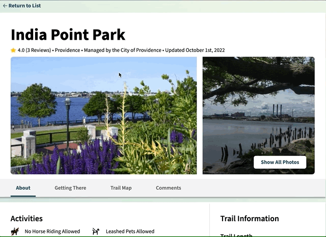
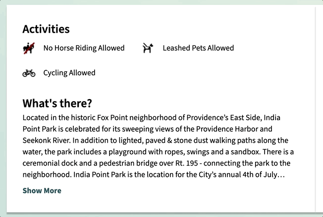
Previously, important park information such as park restrictions were conveyed through unaccompanied icons. These icons had the potential to confuse readers as to what they meant, and also made it more difficult for screen reader use.
To solve this, I made sure these icons are always accompanied with labels that confirm their intended meaning.
This project was critical in developing myself as a designer. Redesigning this website taught me a lot in how to reduce unnecessary design elements and complexity to create simple, clean design. This process also taught me the importance of considering platform responsiveness as a key factor in crafting interfaces.
Completing my cognitive walkthroughs also taught me how to better inform my design decisions, even when longer-term user observation, testing, and insights aren't possible.
When I presented this project to my peers, I felt proud with how much this experience helped me to feel more comfortable in design.
If I had more time, I would...
Since my research process centered on cognitive walkthroughs I completed myself, I would like to examine how others might try and use my current redesign to see what could be further improved. This would also help me to better compensate for any blind spots that I might have missed.
My redesign was only focused on one type of page of Explore Rhode Island's website. I would like to see how the design system I developed for this page could be extended to other parts of the website to create a more cohesive redesign that I could share with Explore Rhode Island.