Circular
A flexible way to experience consumer electronics
Provided clearer value proposition for product + clearer call to action for new users.
Crafted comprehensive web platform to browse, try, and manage consumer electronics.
Facilitated user testing with peers + usertesting.com to improve and validate usability.
Led team of four to design interface for Circular, a Y Combinator Winter 2022 startup providing flexible ownership of consumer electronics, involving multiple rounds of testing and iteration.
Lead UI/UX Designer
User Researcher
Oct 25, 2022 to
Nov 9, 2022
(Two Weeks)
Juliana Han (Co-Lead)
Eric Guo
Kevin Nguyen
Desktop
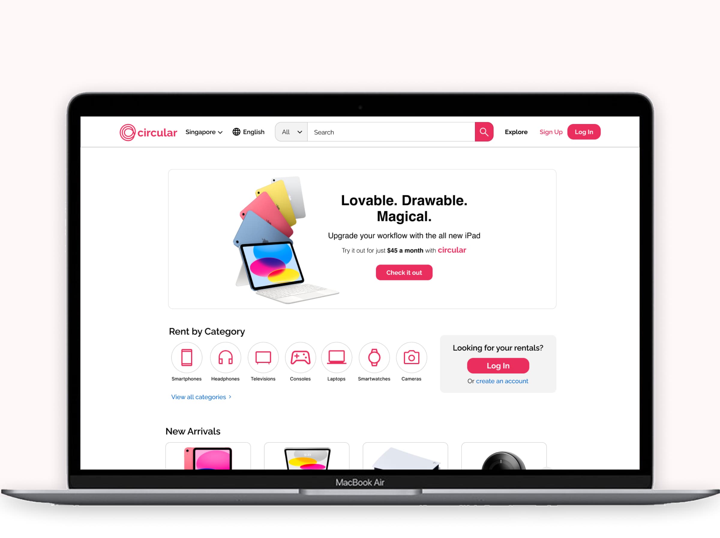
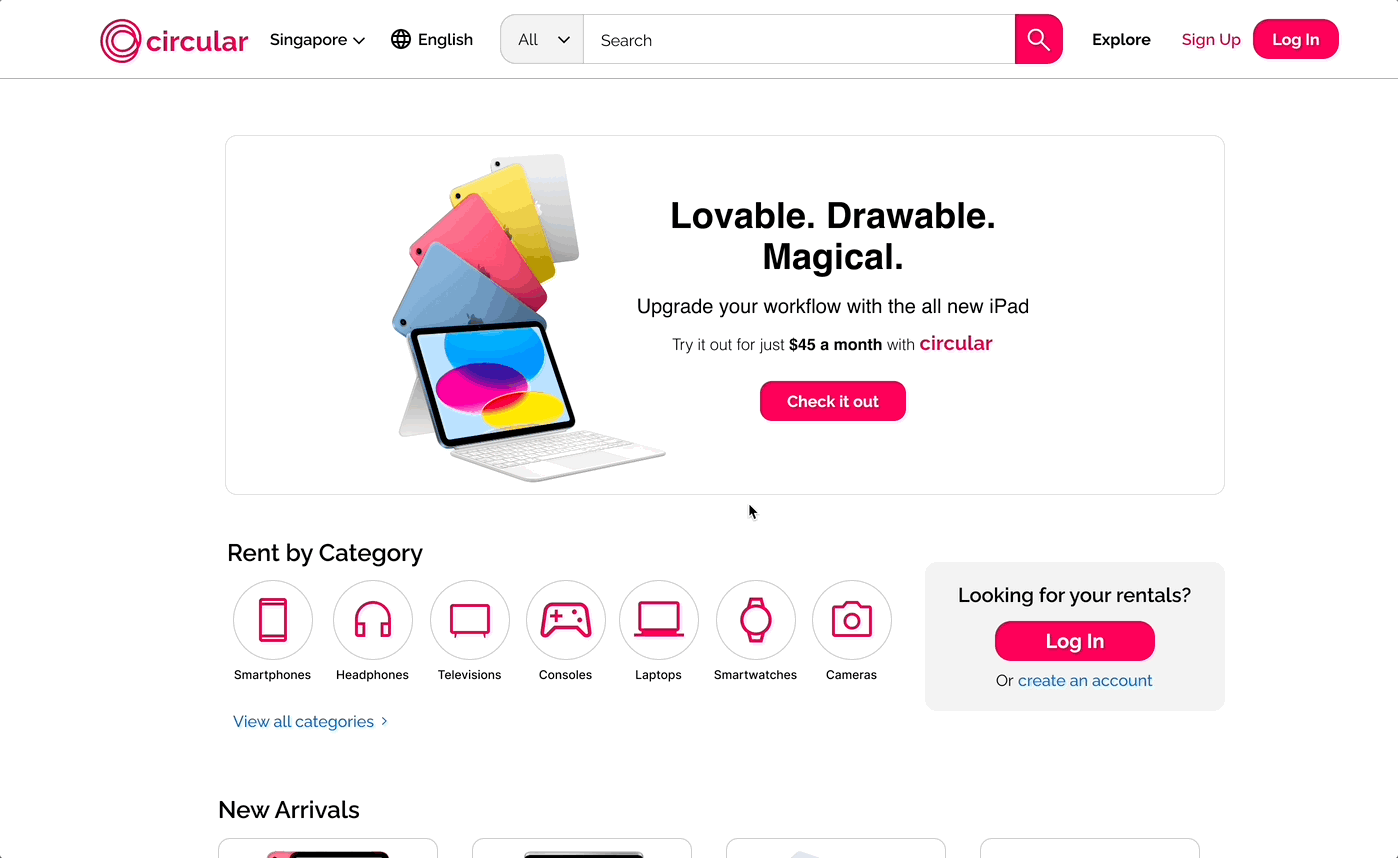
Solution Overview
Communicating the Circular model
Conveying how Circular works to new users in three simple steps, while highlighting popular products to route users to the rest of the website.
Centralized exploration
Providing users insight into seasonal promotions, new product launches, and curated recommendations on one centralized page.
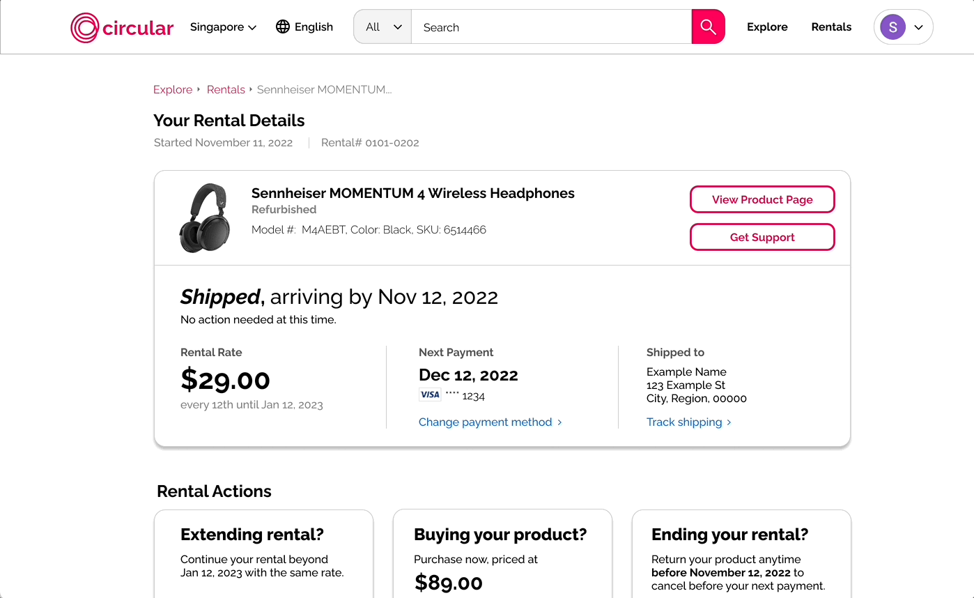
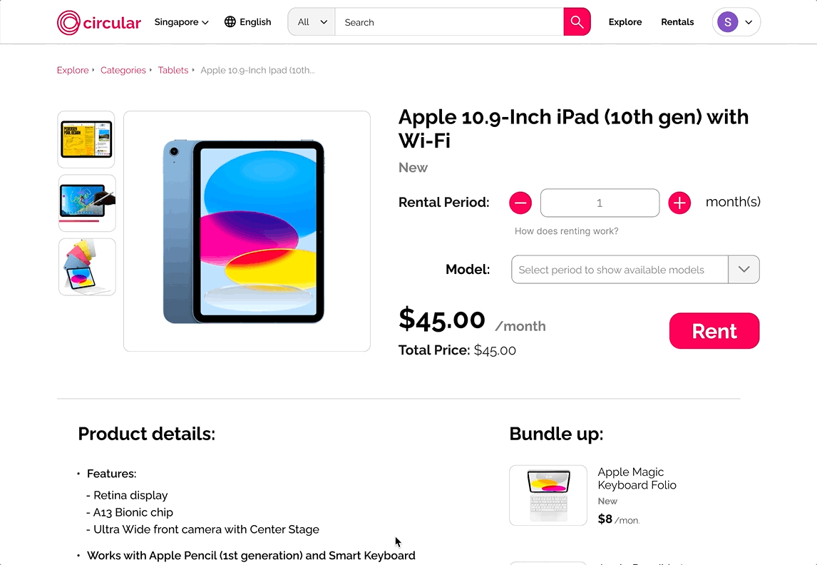
Easily manage products
Communicating rental status, pricing, and all actions users have at their disposable quickly and effectively.
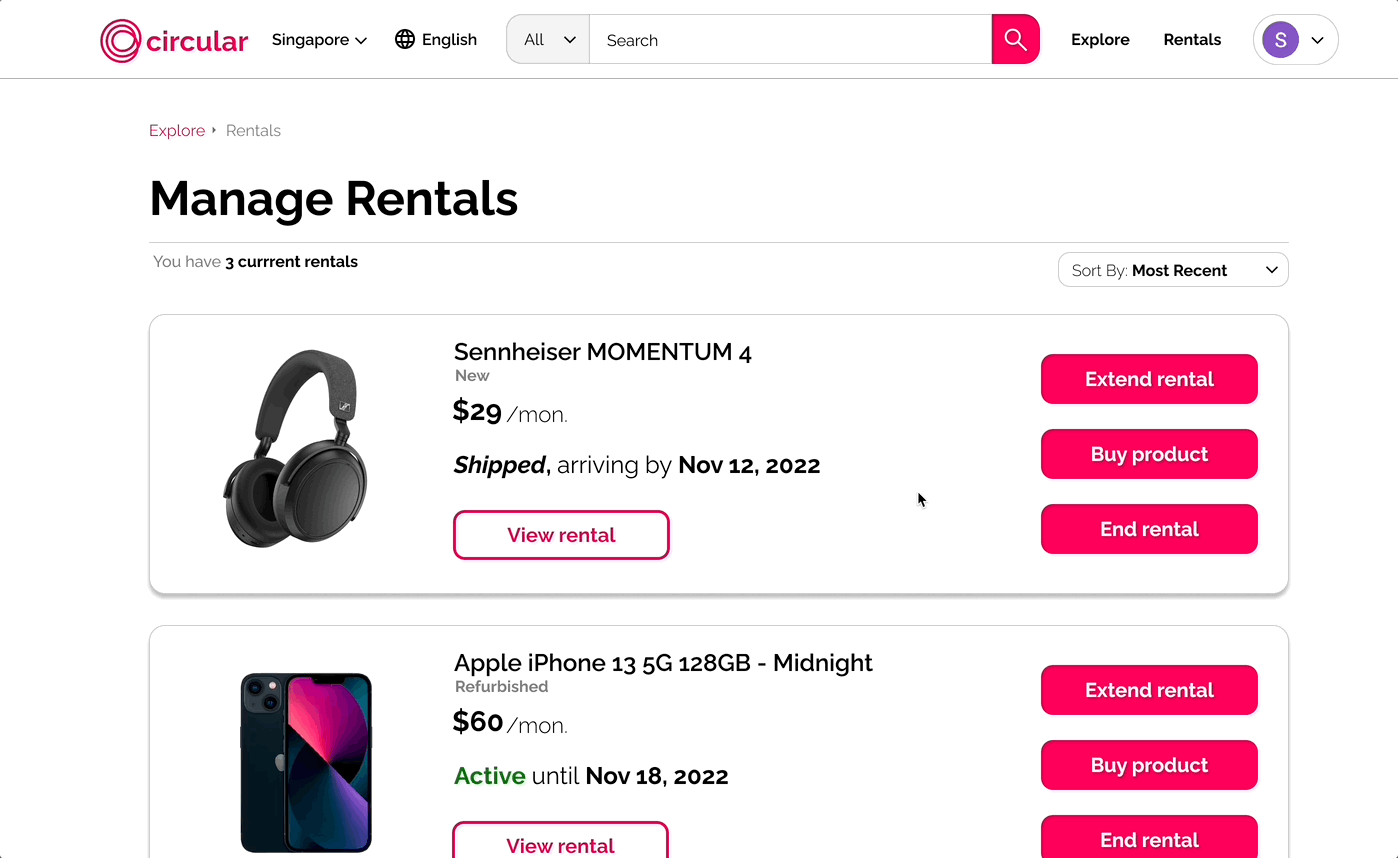
Streamlined actions and information
Letting users know key details about their products, key dates, prices, and access to help, while allowing users to extend, buy, or return products comfortably.
Many existing consumer electronics platforms require customers to commit to fully purchasing or financing the full cost of electronics before being able to use them.
Circular was attempting to change this through a novel approach:
low-cost, convenient temporary ownership that let users try out or rent products before committing.
Design Principles
Give flexibility to the user
Allow consumers to try products before fully purchasing them, providing users more flexibility. Users can pay monthly, keep products for as long as they want, and either purchase or return their products whenever they'd like.
Provide an intuitive process
Intuitively introduce and acclimate users to the Circular subscription model, involving increased reuse of refurbished electronics and temporary ownership.
Convey trust, quality, and choice
Users can easily browse from quality products across diverse categories on one platform, including the latest and most desirable electronics. Flexible access should not mean compromising on quality and choice.
This led me to consider how to design for an emerging startup.
As I was designing a startup's MVP, I felt Circular would have to appeal to users who felt dissatisfied with and excluded by the current distribution model for consumer electronics, to whom Circular's flexible distribution model would likely feel quite unfamiliar.
Our design had to tread a fine line between familiarity and distinction.
This required employing familiarity from existing mental models from platforms users were already familiar with, while distinguishing Circular enough to reflect the unique approach that Circular had as a startup.
Our group sketched a variety of possible design solutions to the challenge, quickly exploring a broad range of ideas, and discussing our varied solutions.
Competitor Analysis
Why this research method?I knew that Circular would have to merge ideas from a wide variety of genres.
Much of Circular's planned functionalities mirrored that of existing e-commerce marketplaces that Circular would compete with. In contrast with these competitors, Circular was an emerging concept involving temporary ownership, short-term rentals, and heightened reuse.
I evaluated plaforms that fit both these sides of Circular: existing e-commerce competitors, such as Amazon, and newer platforms providing less conventional ways to access products, to see what I could incorporate, modify, and avoid.
Traditional E-commerce
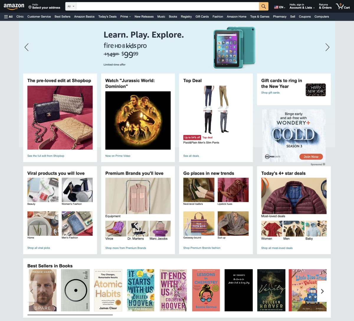
Amazon
Navigating with search and categoriesDespite selling across 33 categories, searching made finding products easy. The search bar itself took nearly the whole size of the navigation bar, making it hard to miss, while searching by category further helped to ease navigating the site.
Homepage clutterAmazon’s home page, with endless cards of varying shapes filling up most of the screen, felt rather confusing to navigate through. Although space-efficient, the layout made exploring new products feel tedious.
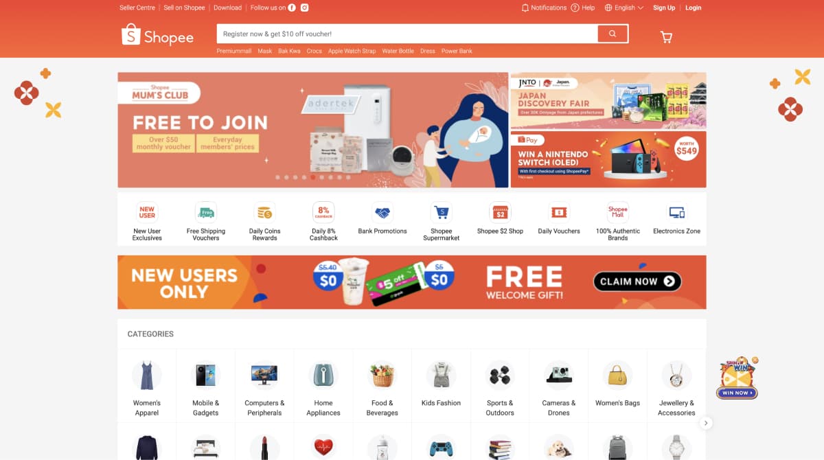
Shopee
Dynamic banners and eventsShopee’s home page contains banners that feature current promotions and new products that change throughout the year. Having dynamic banners allows users to engage with content that remains relevant with seasonal events and trends.
Alternative Platforms
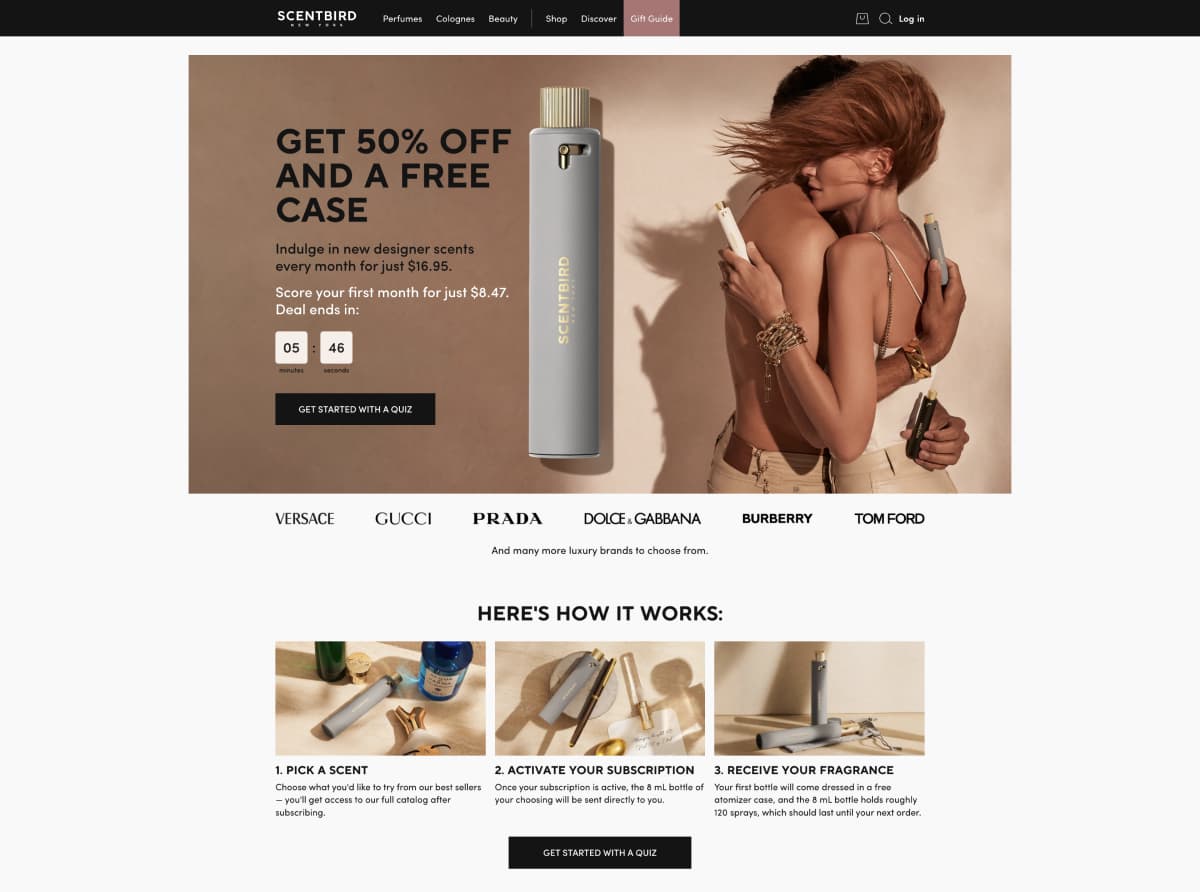
ScentBird
ScentBird allows users to choose samples of designer fragrances on a monthly basis before buying them, intriguing me as another platform providing flexible access to consumer products.
ScentBird directed new users to a landing page with prompts on how their process worked, with a variety of buttons channeling users to view their product offerings and sign up.
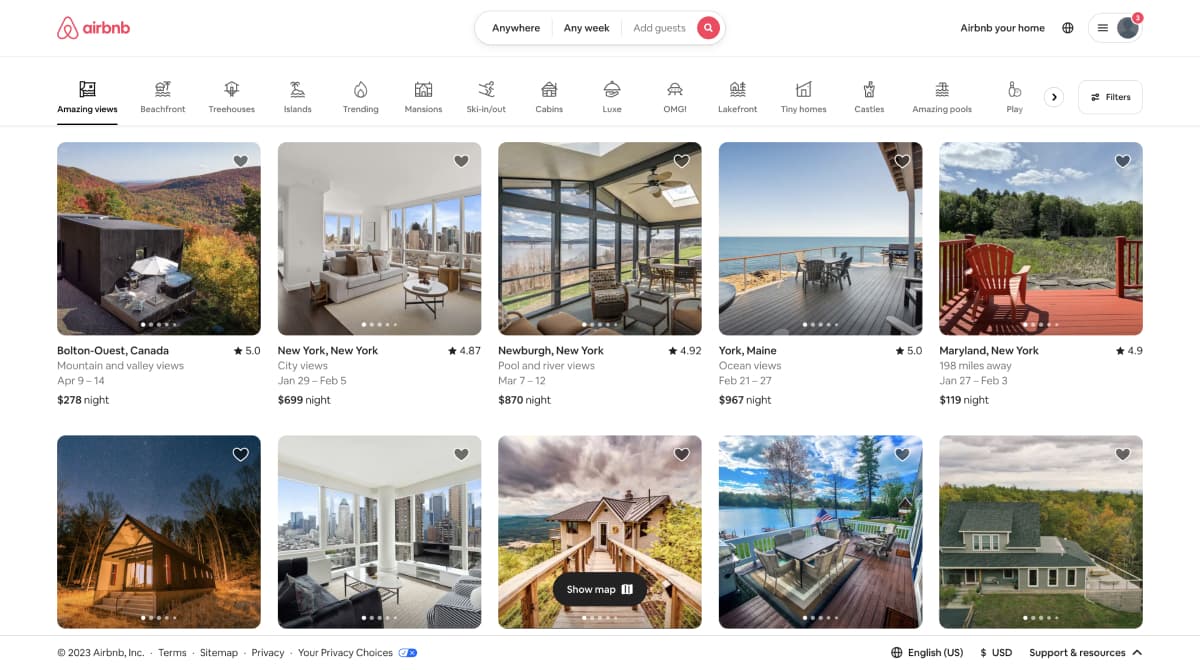
AirBnB
I looked to AirBnB as an established example of a company providing more flexible ways to access products.
AirBnB's search bar, easily noticed at the center of the navigation bar, allows users to use constraints to easily quickly refine searches.
Consistent containersListing's on AirBnB’s home page, with consistent sizing and layout, made scanning feel effortless.
Light stylingA primarily white background with a single accent color places visual weight on listings.
Competitive analysis led me to several design choices.
For marketplaces with a large offering of products, having a prominent searchbar constantly placed in a fixed navigation bar facilitated the discovery and exploration of products.
Provided two benefits: quickly communicating to users the range of products Circular could offer, and allowing users to quickly filter and browse categories they are interested in.
Websites with a simple, straightforward, and consistent process felt the easiest to understand, leading to a three-step approach for communicating Circular's process.
User Flows
Why choose this?With just two weeks for this solution, I decided designing based on user tasks would be time-efficient and effective.
I made sure to consider how a variety of different possible users, each with a unique set of tasks they set out to complete, might be able to access and navigate a single website.
New Users
How might they get acquainted with Circular's flexible subscription model?
How would they browse Circular's selection and rates of different electronics?
How could they evaluate the legitimacy and credibility of Circular?
Returning Users
How would they purchase products that they are currently trying from Circular?
How could they find new products to try and explore?
How might they change information or preferences linked with their account?
On a classroom whiteboard, we created a very rough prototype with dry-erase markers, running through different user tasks with them and experimenting with changes as we went.
This process of rapid prototyping was inspired by Buxton's work on using interactive paper interfaces to quickly iterate interfaces.
 One iteration of our user flow sketching process
Rapid prototyping led to three choices in the Circular's flow.
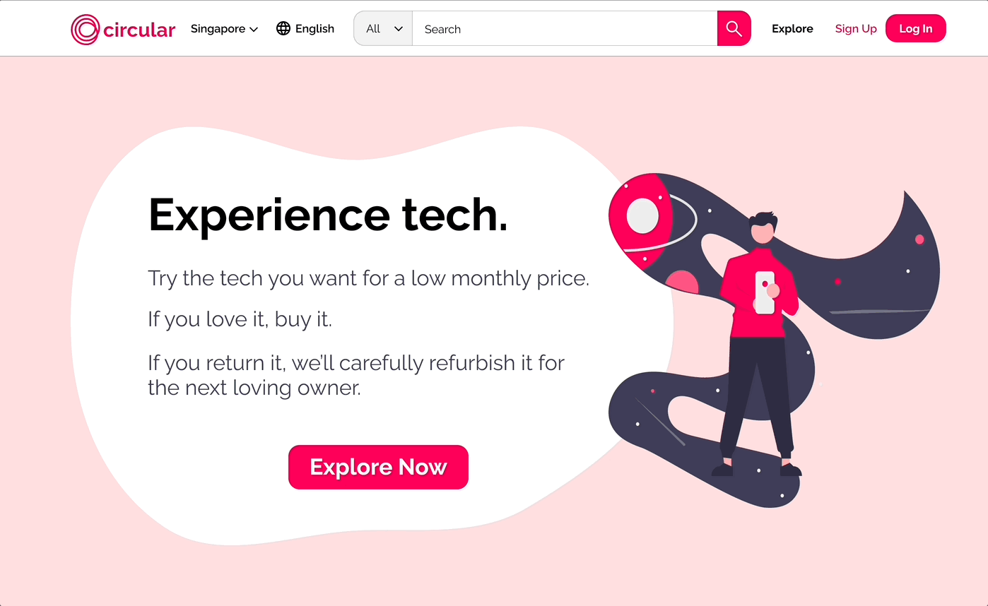
I decided on having users first go through a landing page to acquaint users with Circular's unique subscription model.
A logged out state and logged in state exist for certain pages to prioritize information differently for new users and returning users.
Allowing users to explore and search for new products, and, if logged in, allow easier managing of accounts. Centralization allowed users to return home to reset after errors.
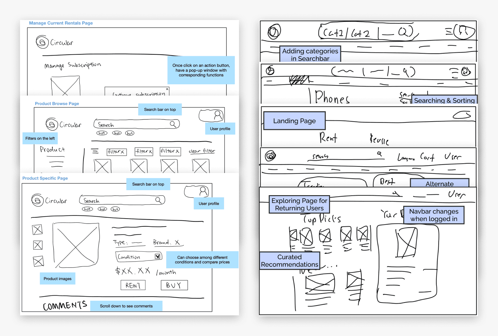
I created a set of low-fidelity wireframes on Figma for the site-wide navigation bars and explore page, while wireframing the landing page closely with Juliana.
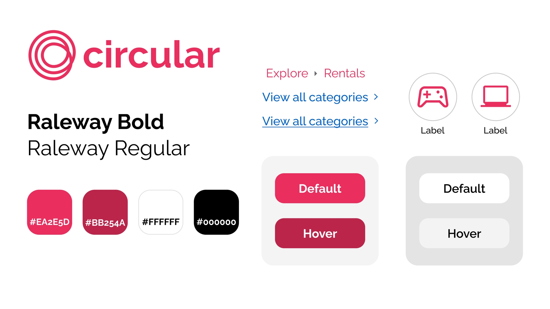
Crafting Visual Identity
Why these choices?
As an emerging startup competing with a plethora of established e-commerce platforms, I found it important for Circular to host a distinctive brand identity centered around an approachable, inviting, and energetic experience for users.
Distinctive color choice
I selected #EA2E5D, a warm, pinkish red, as the primary accent color for my design. Using a vivid, saturated color helps to create a distinctive identity for Circular while retaining good contrast against white backgrounds.
Using this accent color sparingly upon white backgrounds further emphasizes important UI elements.
Friendliness through roundness
I used rounded corners and circular elements throughout my design. Compared to the angular design language that many e-commerce websites I viewed at used, rounded elements helped to further distinguish Circular while creating a more friendly, inviting atmosphere throughout the site.
Initial Prototype
Hosting group testing with our prototype led to more insights.
Our initial prototype underwent user testing through a group critique session. 36 peer students, alongside Gifford Cheung, a senior UX researcher at Nintendo, ran through a variety of tasks on our interactive prototype and shared their thoughts with us.
Group Testing Results
The UX problems their feedback highlighted mapped to several solutions listed below.
Problems
Solutions
This page includes important information, but there is no way of going back to this page once users click the “CHOOSE NOW” button because the logo on the navbar currently links to explore page
Reorganize navbar: link the logo to the landing page, add an “Explore” tab next to the “Rentals” tab
User feedback indicated that information on how renting works is very important and should have a higher priority than the product display section
Put the “How It Works” section above the “Popular products” section
The wording of the “Choose Now” button is confusing - peers expect it to lead to a page where they can browse and choose from available products, but it just leads to the exploration page instead
Change the button from “Choose Now” to “Explore Now”
Second Iteration Prototype
These changes were then used to revise our solution to the version below.
Methodology
With the completed second iteration of our solution, Juliana and I developed a series of tasks and assesments to be presented to three users on usertesting.com.
We designed a series of 4 tasks for each user to complete:Check the available categories of products
Select a category, browse the products, and select a specific product
Learn about how renting works
From the eyes of a returning user, buy a product that they are currently renting
To describe whether they felt they successfully completed the subtask
To rate the difficulty of the subtask from 1 to 5 (1 = Very Difficult, 5 = Very Easy)
With just three users, we focused on collecting qualitative data.
On our user testing platform, Juliana and I decided to ask participants to narrate their thought process out loud while completing tasks. This let us better understand the 'Why?' behind the decisions users made, instead of relying on assumptions.
Analyzing Results
Whenever a user we surveyed had difficulty with successfully completing a task, we came up with specific ways to modify our prototype to better achieve our goals.
Throughout the breakdown below, we marked where certain user experiences led us to specific solutions that we proposed further below.
Imagine you want to find out what types of products the website offers. Now use this website to find this information. Stop when you feel like you have seen a complete list of what products are available.
Click the “Explore now” button on the landing page to go to the explore page; see the selected categories and click the “View all categories” below.
First action was clicking the search bar, then used breadcrumbs to go to the correct categories page
(Reported they were sure that they completed the task successfully, and rated it 4/5.)
Navigated to the correct categories page but did not recognize it as the correct page, then went back to the explore page
(Reported they were sure that they completed the task successfully, and rated it 5/5.)
Thought the categories on the explore page were a complete list, did not see the “View all categories” link
Led to Solution 1
(Reported they were sure that they completed the task successfully, and rated it 4/5.)
Resulting Design Changes
Change the wording instead into “view more categories”. It might also be possible to allow horizontal scrolling to let all categories be displayed on Explore page.
Add additional functionality to create an overlay when clicking this "Rent" button that provides key product information for users seeking new rentals.
Change the wording of conversion buttons on the landing page from "Try" to "Rent" to avoid misconceptions of free trials.
Include tooltips on on the browse page to help explain the renting process.
Provide graphics on buy price breakdown and how the buy price changes based on months rented. For instance, communicating what the price will be if users buy next month and how this month’s rental rate is calculated.
Circular was critical to my growth as a designer and researcher.
This project gave me the experience to better utilize Figma's powerful prototyping features. Through making components used across multiple pages and by several other team members, I became familiar with using Figma components and variants to create dynamic, interactive, and reusable components.
Circular also taught me how to better collaborate with teammates and manage conflicting ideas. While designing, I would often have disagreements with different team members on how to best approach a task. Over time, I learned to take these situations as learning opportunities to broaden my perspective: to understand the approach my teammate took to come closer towards an ideal solution.
This also taught me to always reinforce my claims with data - it is not enough to say that a design just 'feels right'; decisions have to be backed up by insights, research, and data to be effective and be effectively communicated to others.