Check In
Understanding clinical care experiences at Brown
Since September 2021, clinical care at Brown University has been centralized at the new health and wellness center. I wanted to better understand how different users experience visiting the new clinic, from walking in the door to being taken care of, in order to find room for improvement.
User Researcher
Interviews
Storyboarding
Persona Mapping
This was my first time crafting a whole UX research project, from A to Z.
While I spent the past summer researching at the Brown Language and Thought Lab, there I worked on assisting existing projects alongside others. This project required me to assume ownership over every step: from writing precise questions, to approaching strangers to ask about their experience, all while respecting the sensitive subject matter of health. This was also my first time crafting personas and storyboarding with real insights.
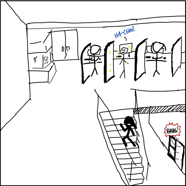
First, I got familiar with the check-in interface and its surroundings.
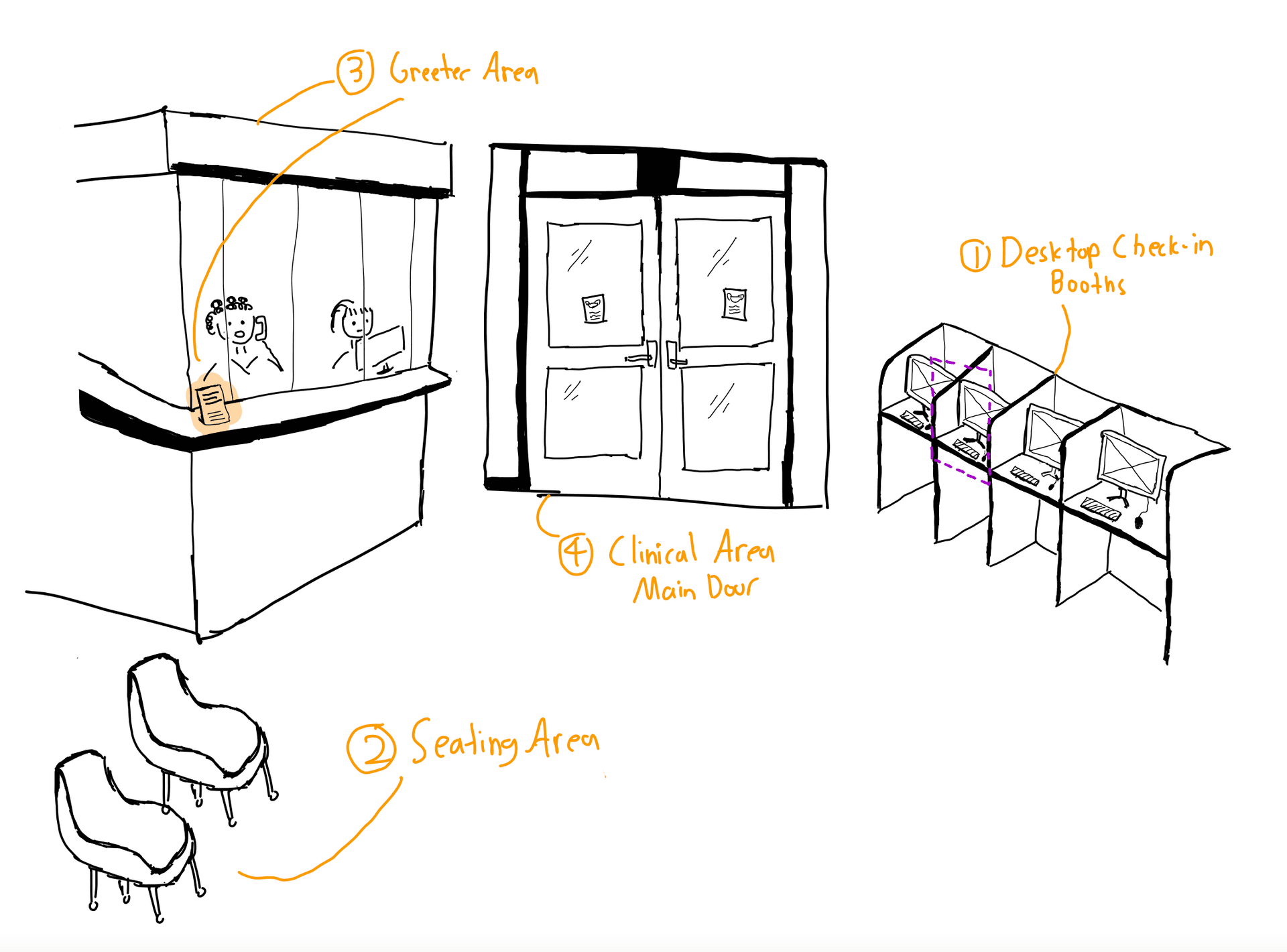
The check-in interface consisted of four sections:
Desktop check-in booth where users validate their identity and update health information.
Seating area for users to sit and wait for their names to be called after using the booth.
Greeter area where staff members answer miscellaneous inquiries.
Clinical area entrance where nurses primarily call checked-in users inside to meet providers, and escort users out afterwards.
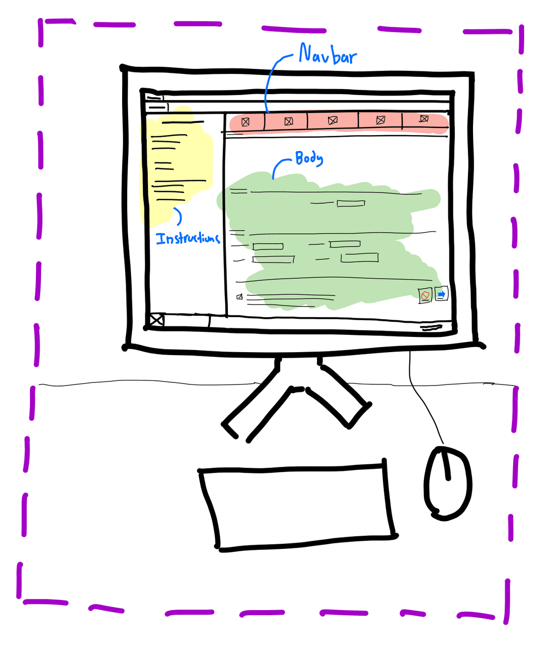
The desktop interface is itself comprised of three main components:
Navbar indicating which of the 5 pages a user is on.
Instructions containing paragraphs on how the displayed page should be used.
Body holding the fields, options, and checkboxes for each page, with a "Cancel" and "Next" button pair that resets the program and submits the displayed form respectively.
Second, I observed users as they checked in to the clinic.
Over two weekdays, I waited in the public seating area and observed 12 users in the morning and afternoon. I avoided observing up close how users filled out forms on the desktop check-in to respect their privacy. Instead, I focused on observing how each user navigated the station, including how long they lingered on each section, and their interactions with staff.
These were some of my key observations:
Half of these users stood and waited for several minutes while staff were busy, all without noticing a printed page instructing users to check-in with the computer. Most of them seemed somewhat confused upon entering the check-in area, with the staff telling most of them to "just use the computer".
These users tended to rush directly to a desktop, check in, then approach staff to apologize and see if they could still be seen. One user spent 10 minutes rescheduling with staff, as User A's schedule conflicted with many of the suggested times.
They later remarked: "I'm a med student...I can't control when my lab ends."
Outside of this minority, most seemed to appear unsure on how to check-in; scanning the room, observing others, before approaching a staff member.
Next, I spoke with three users to hear about their experience directly.
To make this process less daunting, I created an interview guide of 8 questions to better understand what underlying goals, frustrations, and emotions they associated with the experience. I crafted my questions based on Dillman's basics of crafting good questions, emphasizing open-ended questions to capture more information, and keeping it simple and objective.
Depending on how the conversation went, I followed up on related topics that my interviewees expressed interest in discussing, while making space to answer any questions they had about my project.
My Interview Guide
Have you checked in here before today?
What initial reactions did you have when you arrived at the check in area today?
Did you experience any difficulty in understanding how to check in?
(If they used the computer) How was your experience navigating the computer?
What do you wish the check in process could accomplish differently?
Were there any parts of checking in that you enjoyed? If so, could you tell me about them?
Do you have any other concerns about the check in process?
Is there anything else about your experience today you'd like to share?
I then summarized the key points I learned from talking with three users.
All three felt the desktop program was "cluttered, outdated, and hard to read," and wished that the process was more streamlined.
Users B and C were both first time users and undergraduates on campus for less than 2 years. Both were unsure on which section to first visit and felt nervous approaching staff. They both were anxious about how their presence could be acknowledged by clinicians.
User B, relatively new to the interface, was frustrated that the desktop check-in took far longer than they expected and caused them to be late, despite having come "extra early". Meanwhile, another user, having been using the system for 5 years, claimed to be able to now check in extremely quickly "without reading instructions."
User A wished that the desktop required less physical contact, as once they were forced to use a booth right after somebody had coughed on it as they were running late. They also wished a way existed to display a wait time and queue for those waiting.
To analyze my findings, I devised two personas based on these insights.
I worked to synthesize my findings into two distinct personas, each capturing a distinct set of behavior patterns. To better inform myself, I read Chapter 5 of Alan Cooper's "About Face: The Essentials of Interaction Design" to provide a framework for developing research based personas. During this process, I focused on exploring the underlying motivations behind the check-in process, emphasizing the 'why' moreso than the 'what'.
Scattered Sakshi
25 Years Old
Sakshi is a med student, juggling her time between managing a lab project, volunteering at the hospital, and studying. Sakshi schedules biweekly clinical visits to manage an ongoing health condiiton between commitments, without much time to spare.
Sakshi is based on observations of several users, alongside findings from my conversation with User A, who all arrived late. Sakshi represents those who possess more familiarity with the check-in process and struggle to fit their appointments within their busy schedules.
The keyboard and mouse are unhygienic, yet take too long to disinfect before use.
No wait time or queue information is provided while waiting.
Rescheduling any missed appointments takes a significant amount of time.
"If it's 4:04PM now, and if I sprint, I shouldn't be too late..."
"If I can't make it today, I'll have to reschedule to finals week, which really won't work."
"That time only works if lab ends on time..."
Hesitant Harry
19 Years Old
Harry is a sophomore in his first in-person year at Brown, navigating dorm-life and living alone for their first time, and is a combination of Users B and H. Today is Harry's first visit to Health Services to get a vaccination shot.
Harry is based off my observations of numerous users and conversations with Users B and C who required more staff guidance to successfully check in. Harry represents newer users less familiar to checking in, who feel pressured to avoid any mistakes.
A lack of appropriate affordances to indicate which section to first go to check in.
Difficulty reading and using user interface elements on desktop.
Feels unseen by healthcare providers while checking in.
"Where should I go first?"
"What if I fill out this form wrong? Is that OK?"
"How do I let the doctors know I'm already here?"
To further explore Scattered Sakshi's user journey, I created a storyboard.
This was a challenge for me as I rarely draw human characters, so I spent much effort to go through multiple drafts, practice sketching expressions, and using examples from comics to better portray the experience. While crafting this storyboard, I focused on the three pillars of authenticity, simplicity, and emotion to frame Sakshi's experience.
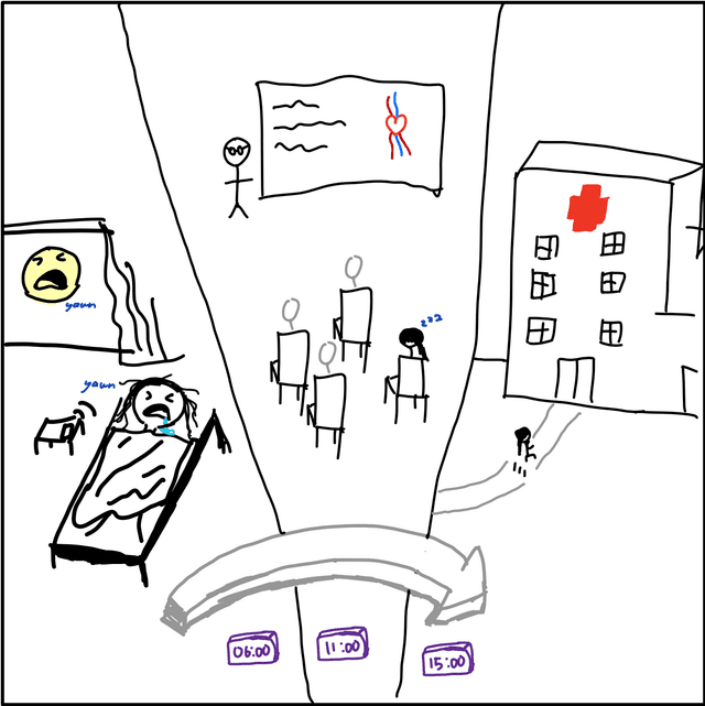
Sakshi spends the day cycling through lectures, volunteer work, and finally her lab.
Sakshi is working at her lab, expecting to finish when the lab runs into an unexpected problem. Her Professor asks her stay and help out: "Just another 15 minutes!"
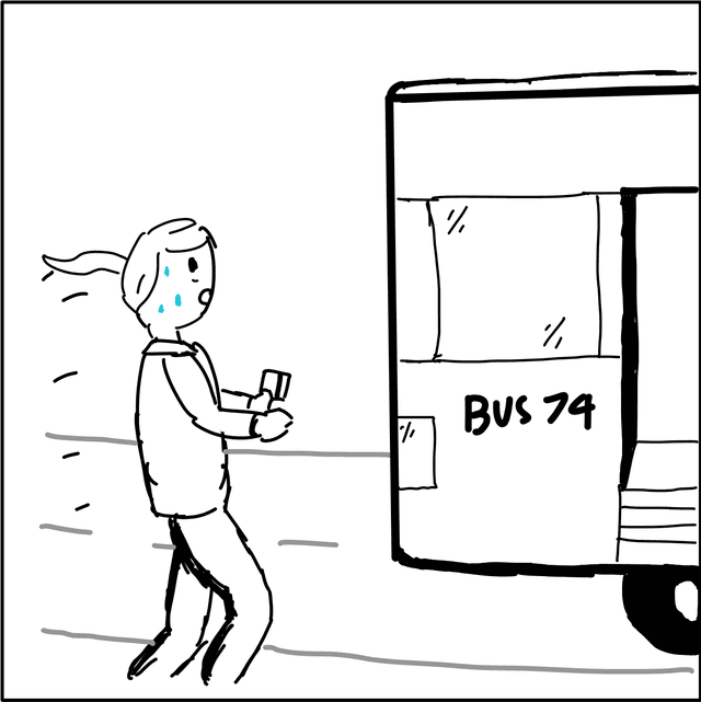
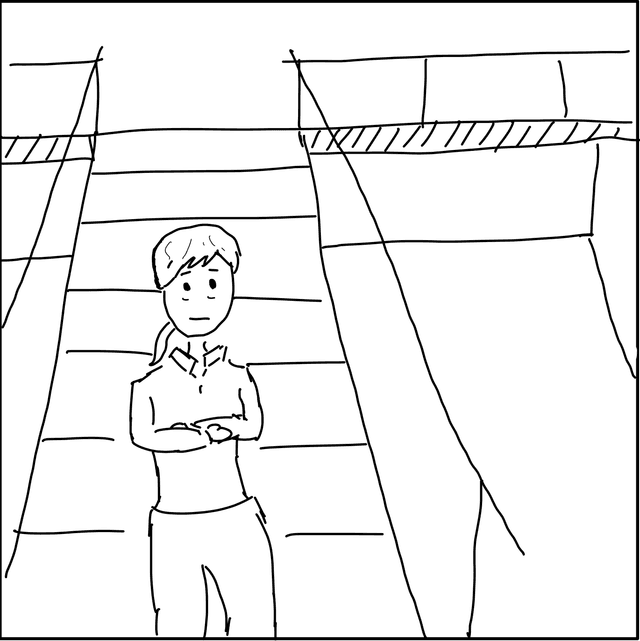
30 minutes later, Sakshi sprints out of lab, barely catching the bus to 450 Brook St.
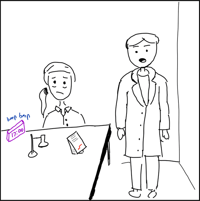
She arrives at the building, slamming open the door and sprinting up the stairs, as the user before her leaves their booth while coughing right into the keyboard.
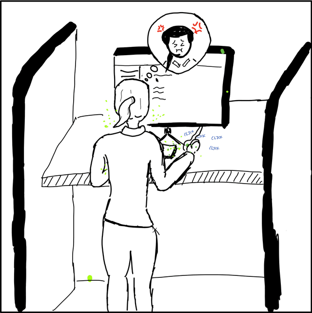
After heading straight towards the nearest available counter, Sakshi, while grossed out, furiously clicks and types through the program just as she's done a thousand times.
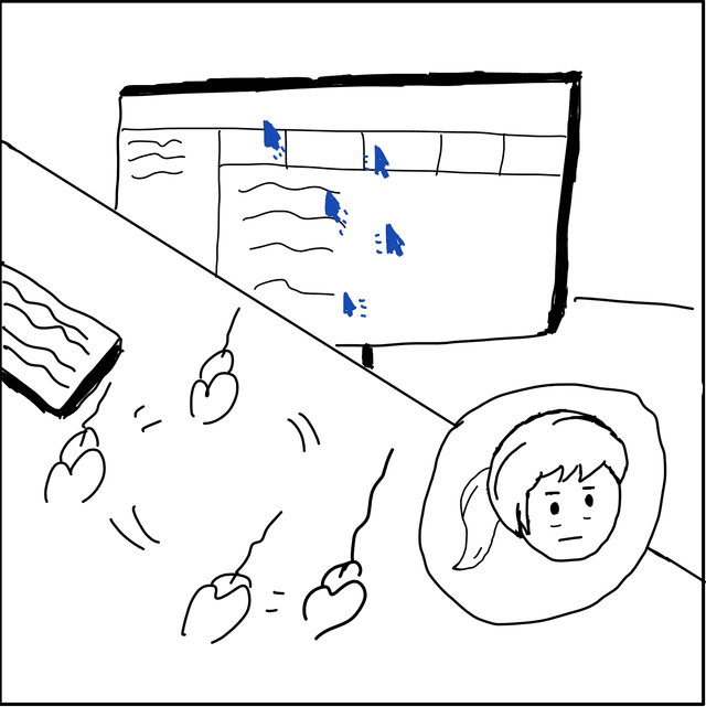
Through each section, Sakshi ignores the paragraphs of dense instructions and text; using her experience to speed through the clunky program ASAP to not miss her appointment.
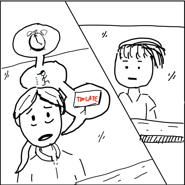
Unfortunately after the program says she is too late, she goes to the Greeter Area and makes her case: "I'm sorry I'm late - I came here as fast as I could!"
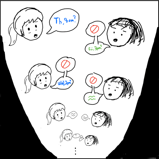
They spend the next ten minutes trying to reschedule. They go back and forth: "2:00PM? No I cant do then, could 2:00pm Wednesday work?" "...What about Thursday?...Friday? [and so on]..."
After scheduling another appointment tightly packed between her commitments, Sakshi walks away disappointed, back again where she first started.
As my first major UI/UX experience, this research project was truly valuable to my growth as a designer.
Looking back, it was truly exciting to put the UX tools that my UI/UX class introduced to work, in examining a part of campus that I find important in a deeper light. This project forced me to learn in a lot of ways which I found valuable in helping to develop my process; in forcing me to practice sketching and visual imagination to communicate my ideas, in planning every step of a research project, and interviewing and observing users in real life.
shaunlatip@gmail.com
Coded with React & Next.js © 2022 Shaun Latip